Picking paint colors is one of the most stressful parts of a home refresh — but it doesn't have to be. Here's the process we walk every Greenville homeowner through before we ever pick up a brush.
Start With What's Already Fixed
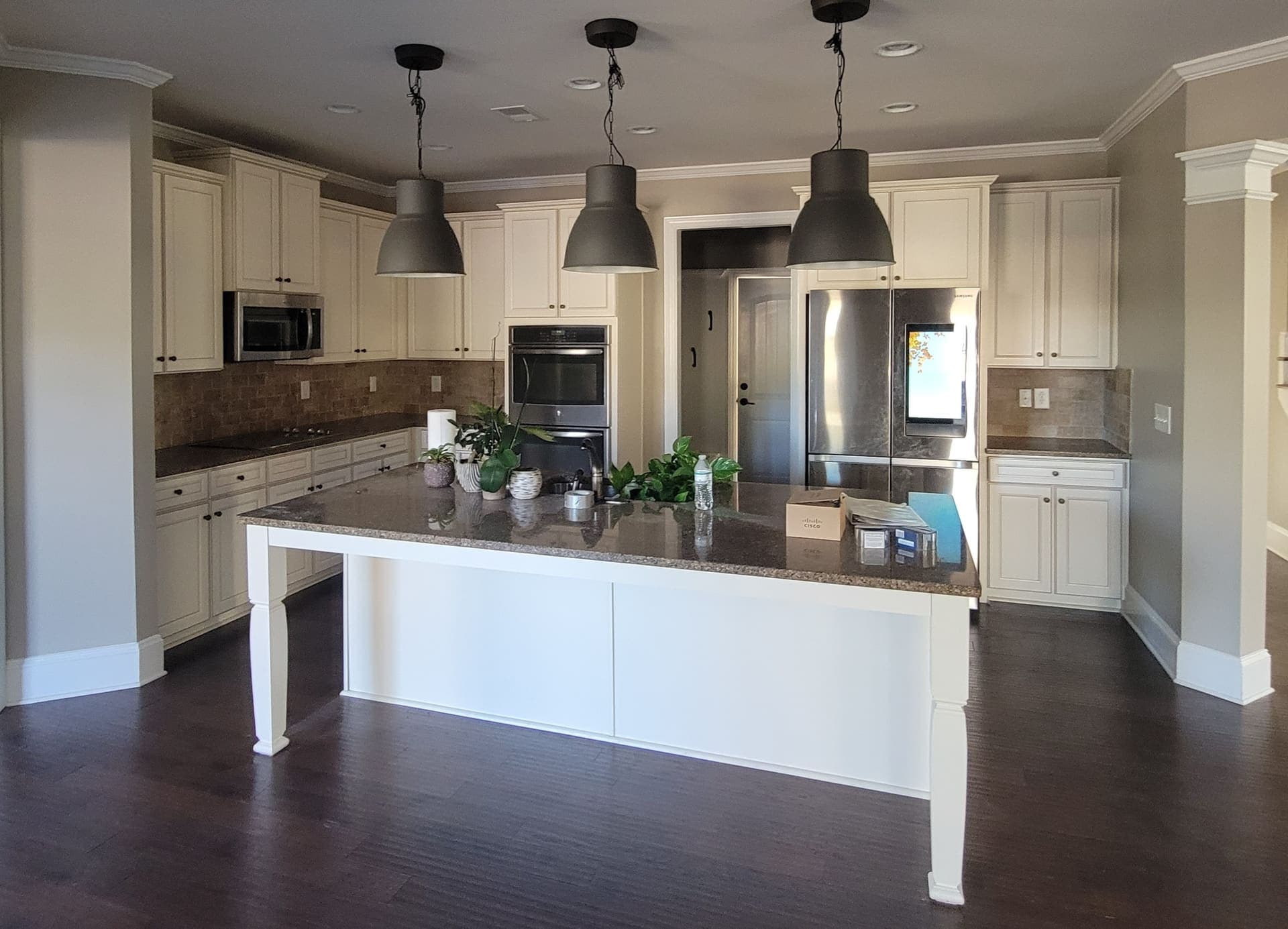
Before you open a single paint chip, take inventory of what isn't changing. Your flooring, countertops, furniture, tile, and cabinetry all have undertones that need to work with your wall color — not fight it. A warm-toned hardwood floor and cool gray walls can look muddy together even if both are beautiful on their own.
Pull out the largest piece of fixed material in the room and hold paint samples next to it in natural light. That's your starting point — not the color you saw on someone else's Instagram.
Understand Undertones
Every paint color has an undertone — a subtle secondary hue hiding beneath the surface color. White isn't just white: it might be creamy (yellow undertone), icy (blue undertone), or rosy (pink undertone). Gray can pull green, purple, or blue. These undertones become very visible once the paint is on four walls under your specific lighting.
Pro tip: Hold the paint chip against a pure white piece of paper. The color shift you see is the undertone. This is far more reliable than looking at chips on the store rack.
Test Before You Commit
Sample pots exist for a reason. Paint at least a 12" × 12" swatch directly on the wall — not on a piece of paper you hold up. Let it dry completely (colors shift significantly as they dry), then observe it at different times of day: morning light, midday, and evening with your lamps on.
Test your top two or three contenders on adjacent walls so you can compare them under identical conditions. What looks perfect on the north wall might look completely different on the south wall when afternoon sun hits it.
"The single most common color regret I hear from homeowners is not testing first. Spend $15 on sample pots. It's the cheapest decision you'll make in the whole project."
— Rich Bardy, TruCare Painters
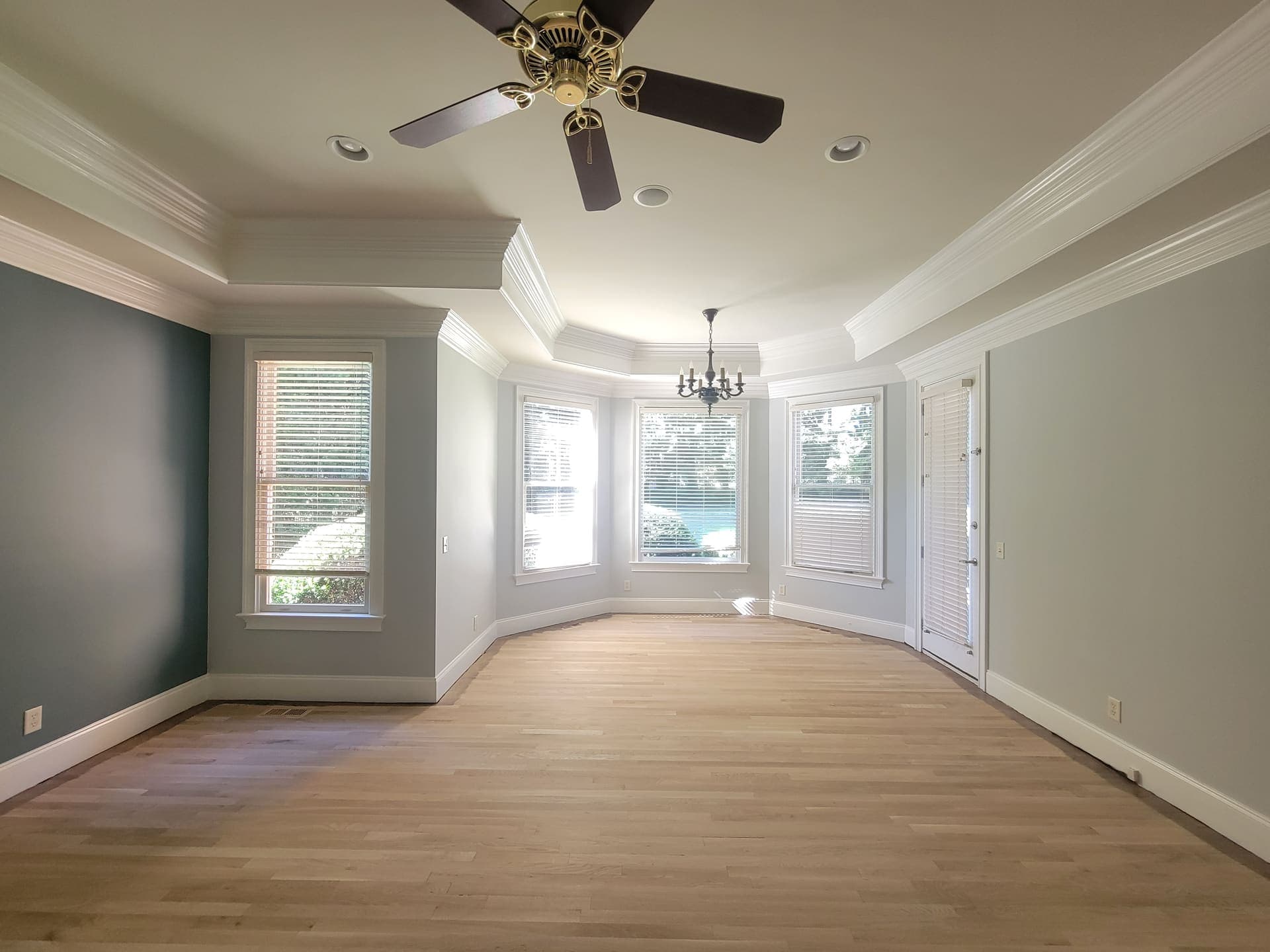
Think About Light — Natural and Artificial
North-facing rooms receive cool, indirect light all day. Colors in these rooms tend to look more muted, so warm neutrals and soft whites read better than cool tones, which can feel cold and flat. South-facing rooms get bright, warm light that can make cool colors come alive and make warm colors feel overwhelming.
Artificial lighting matters just as much. Incandescent and warm LED bulbs amplify warm undertones. Cool daylight bulbs pull out blue and green. If your main living areas use warm bulbs and you choose a gray with blue undertones, expect it to look noticeably purple by evening.
Have a project you’d like us to look at and talk through colors? We’re happy to come out, take a look, and share what we think — no pressure, no commitment. Let us know.
Create Flow Between Rooms
Open floor plans and hallways that connect multiple rooms need colors that transition well, not colors that clash when viewed together. One approach is to pick a neutral for the main living areas and use a slightly deeper or more saturated version of the same hue in adjacent rooms. This creates cohesion without making every room look identical.
Another approach: choose one consistent trim color throughout the house (typically a bright white) and let the wall colors vary. The consistent trim acts as a visual anchor that ties different rooms together even when the walls are different colors.
Sheen Level Matters Too
The same color can look dramatically different in flat versus satin versus semi-gloss. Higher sheens reflect more light, which makes colors look slightly more saturated and vibrant — but also reveal every wall imperfection. Lower sheens absorb light, which reads softer and hides surface flaws.
- ✓Flat / Matte — ceilings and low-traffic areas; hides imperfections
- ✓Eggshell — most living rooms and bedrooms; soft and washable
- ✓Satin — kitchens, hallways, kids rooms; durable and easy to clean
- ✓Semi-Gloss — trim, doors, and cabinets; highest durability
Rich Bardy — Owner, TruCare Painters
Rich has 18 years of hands-on painting experience. He started TruCare to give homeowners straight answers, consistent crews, and work that holds up. He writes the TruCare blog to share what he’s learned in the field.